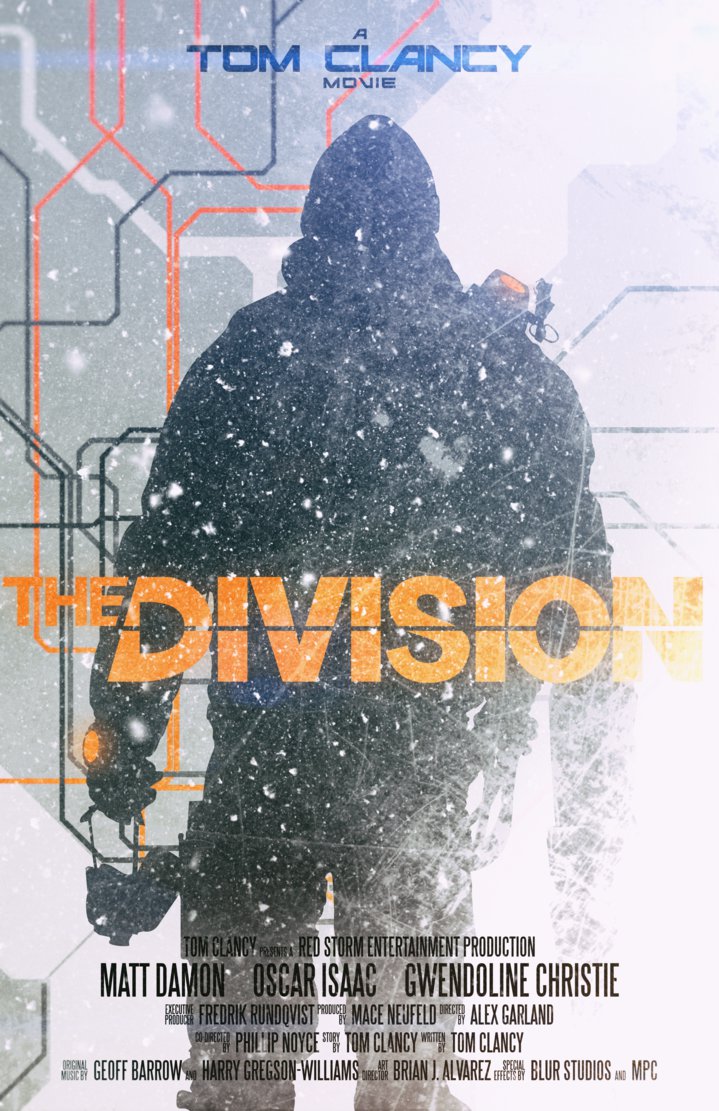
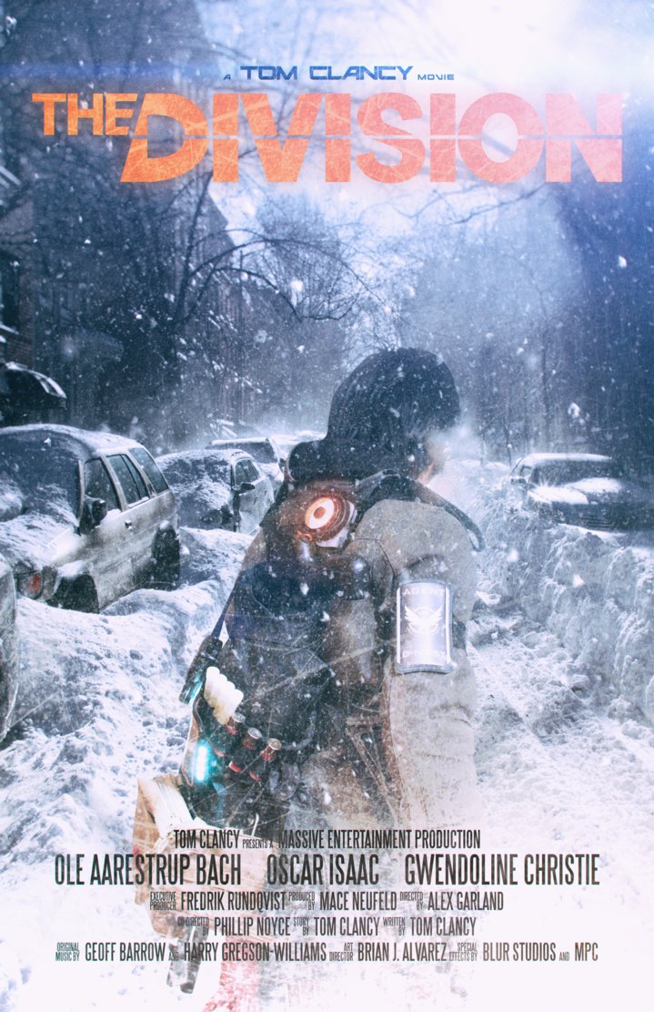
Examples


My main aim is to have a main character centered either at a slant or facing away. This gives off the sense of being detached and makes it seem less personal as the character wont look at the audience. It can leave questions in their minds such as why wouldn't they give immediate address to the audience. This draws people to the film as the curiosity makes them interested and means people will want to consume the product.
As well as this, the majority of the gear/kit my character uses will be visible from behind, so by using this angle of the charcater I'm ensuring the Mise En Scene is complimentary of my ideologies. The audience needs to grasp from the poster that this character isn't just any survivor. It needs to be immediately known that they're part of an elite team designed to control situations like this. In a situation like the one in my product, there are various archetypes of people. The one's who're prepared and have the means and method to survive with the relevant equipment and expertise. Those who try their best. And those who follow the fall in society and become lawless savages.
No comments:
Post a Comment