Friday, 6 January 2017

My Poster Flatplan


The idea for my poster is to have the key features defined whilst keeping it minimalistic. The main conventions such as the Billing Block and Title are parts of a poster that most people will recognise immediately. So by ensuring that these are seen and noticed I can give direct address in the sense that it should be immediately recognised.

The simple design allows me to focus on quality as opposed to quantity. The minimalistic design allows for the product to be done in a short amount of time whilst still allowing it to be effective. I can focus more directly on the colour scheme and fonts as well as the main and background image, rather than over crowding the poster with many imposed layers that are unnecessary.

The idea of keeping it empty is also keeping with on of my key themes of loneliness and solitude. Having just one person and not much else on the poster is reflective of the society and reality around the character due to the event's that have transpired. This is an effective mechanism in which people can get a sense of what the film will be like just by looking at the poster.

Wednesday, 4 January 2017

Poster Conventions

Image result for film poster

As seen in this poster for Liam Neeson's "The Grey" there are many conventions that posters rely on to make them universally recognisable. These allow the audience to look in certain predetermined places for key information. For example the production information is normally at the bottom of the poster and is usually either very dominant or slightly faded using binary opposition of the colours.      

A picture that fills the whole casing - This is to draw in the consideration of the intended interest group. Were it to be a little picture, it wouldn't be as engaging and they may investigate it. In any case, if the picture fills the casing or looks strange, the consideration is instantly gotten. 

A title - Generally towards the base of the page, the title is made of maybe a couple fundamental words, and is in a basic textual style that is normally capitalized. The few words implies that it remains in the groups of onlookers psyche and is anything but difficult to recollect. Most movies have "the" and afterward a word, yet in discussion, "the" is typically cut off on the grounds that the single word tailing it is more huge. The straightforward text style is generally a serif textual style and it is great and broadly utilized, and it is in capitalized to draw in consideration. 

A discharge date - A fundamental bit of data, the maker can put the date towards the base of the blurb, typically in an indistinguishable text style from the title, to tell the crowd when it is discharged. On the off chance that a discharge date has not yet been chosen or reported, then "coming soon" will be utilized to make interest. The group of onlookers will then be checking consistently concerning when the film turns out in silver screens. 

Institutional data - When included, this area of data points of interest the data of who is featuring, or chipped away at the film and is demonstrated subtly at the extremely base of the page. This tradition isn't generally took after in light of the fact that the gathering of people doesn't discover it that intriguing or valuable. While it can be utilized to see who is in the motion picture, blood and gore flicks tend to utilize performing artists that aren't renowned so they wouldn't perceive the name at any rate. Were the name of an essayist, executive, maker or performing artist to be classed as imperative, then they would put it elsewhere on the publication to draw in consideration. 

Primary picture - This will dependably reflect something that is huge to the account, be it the opponent, hero, area, or weapon. The picture for the most part elements some type of horrendous symbolism, which might be evident or inconspicuous, so connote the class of film that it has a place with. The principle picture additionally tops off the whole edge, and when there is a special case, the dark space accentuates the fundamental element of the picture. 

Slogan - Short and basic, this sentence, or gathering of sentences, makes interest for the group of onlookers, improves their dread marginally and maybe their comprehension of the film making them need to go and see it while tying down the significance of the picture and associating it to the title.

Friday, 30 December 2016

My Poster Style

Examples


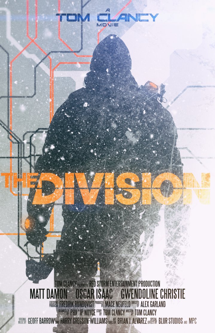
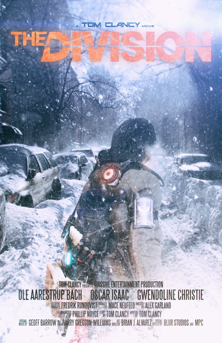
Image result for the division poster Image result for the division poster Image result for the division poster

For my one of my ancillary tasks, I'm going to produce a poster. Where my product is based off of a pre existing product, there are already fan and official posters made for short films. This allows me to draw on inspiration from others.


                                         Image result for the division

My main aim is to have a main character centered either at a slant or facing away. This gives off the sense of being detached and makes it seem less personal as the character wont look at the audience. It can leave questions in their minds such as why wouldn't they give immediate address to the audience. This draws people to the film as the curiosity makes them interested and means people will want to consume the product.

As well as this, the majority of the gear/kit my character uses will be visible from behind, so by using this angle of the charcater I'm ensuring the Mise En Scene is complimentary of my ideologies. The audience needs to grasp from the poster that this character isn't just any survivor. It needs to be immediately known that they're part of an elite team designed to control situations like this. In a situation like the one in my product, there are various archetypes of people. The one's who're prepared and have the means and method to survive with the relevant equipment and expertise. Those who try their best. And those who follow the fall in society and become lawless savages.


Wednesday, 28 December 2016

Analysis of Posters

Analysis Of Posters


Related image Image result for sherlock holmes posters Image result for sherlock holmes irene posters

The range of posters released for the Sherlock Holmes advertising campaign were all very similar in design, whilst varying slightly in content. The range of posters was designed to create familiarity in the recognition of the posters for the audience. The way in which they mirror each other links them all together and makes the overall campaign seem much more varied and interesting, if the audience becomes bored of a poster, the may associate this dislike with the film itself, this technique of releasing a variety throughout the campaign maintains interest and entertainment.

The poster shown above has been kept extremely simple in order to maximise impact on the audience. The overall colour is kept dark and dull so as not to detract from the main image. The image in the background is of a dull and rainy scene, possibly mirroring the setting of the scene, the small image of boats and a harbour is another location indicator, and suggestion of the narrative. The characters themselves shown in the foreground are an indication of the genre of the film and also the time period, this is shown through their costumes (moustaches, haircuts, and style of clothes) and their props. However, not only do they indicate the setting of the film, but also the target audience, as the age of the characters suggests that this is not a film for children.

The overall impression of the poster is also an indicator of this, as is portrays an image of ominous darkness, suggesting possible danger. The body language of these characters also suggests their status, as the man standing in the front is clearly in charge. The position in which he is standing is very dominant, and his facial expression suggests power and knowledge. The man standing behind him is also clearly upper class, which is indicated by the way he holds his head and also his general style of dress. The cane and top hat also suggest the time period and his social status, however the way he stands behind the first man shows his submission and willingness to relinquish control. The title of the poster is displayed in capital letters clearly across the top of the poster, the light colour of the lettering stands out against the dark dusky background, as does the pale typography of the actors names displayed along the very top. The release date is shown across the bottom of the poster in the same font, slightly larger than the actors names but much smaller than the title so as not to detract from it. The border around the poster is simple but effective, indicating the narrative but not drawing attention to itself.The backgrounds in each of these posters are kept dull and blurred to draw the eye of the audience to the character.

The tag line in Sherlock Holmes themselves poster is simple and effective, shown printed across the character just below his name, its font size in comparison with the title shows that the fact that nothing escapes him is almost irrelevant, as the name "Holmes" on its own is enough to sum up this amazing character.

In Watsons poster he has his head dipped as though he is assessing the audience, an indicator of his personality. By revealing each of the characters separately in this way one by one, the producers enable the audience to become closer to them, as they can analyse them in more detail, leading them to have a better understanding of to the characters and their story.

The image in the  female characters poster portrays her as being very seductive. The tight corset like dress and immaculately curled hair suggest that she is fashionable and desirable, whilst the pink dress implies femininity. However although the way she dresses implies she is a delicate and girly woman, her facial expression suggests that she is confident and in control.

Friday, 23 December 2016

Change To Trailer

Due to changing some of my shots and recorded scenes. I decided to change the trailer in most of it's entirety, this meant the trailer would have a different feel to it. I've cut back on the amount of fight scenes and firefights and instead have the trailer giving you the start and background to a story that will later be told in the film. Equally due to the software I was using being removed from the school system to create my after effects, I can no longer implement the holographic effect for the character's "Smart Watch" and therefore this scene had to be scrapped. Looking at most teaser trailers in contemporary media many tend to just use a constant monologue over pre recorded footage as I intended too, however this tends to usually cover the entirety of the trailer which is where I've made the change. This means that some scenes will have less significance than before The new voiceover can be found below.


New Monologue-
In times of crisis people flee and panic sets in. In an instance where no one has power and everyone is looking out for themselves and only themselves. It seems there is no hope. But all hope is not lost, there is a chance to start a new. A chance for redemption and survival.

When we were activated we knew the situation was bad, worse than anyone knew. We are an elite highly skilled group of embedded agents formed under the Catastrophic Emergency Response Agency’s Command and COBRA. They only call us when everything else has failed. We have no rules we have no limits our only job is to protect what remains.

We are your coworkers we are your neighbours, we might even be your friends. But when we get the call we leave everything behind. In a society where all has fallen we are the only ones who remain a group of battle hardened survivors. After seeing countless numbers of your loved ones turn against your cause and kill in cold blood. What would you do.

We can't stop this. But what we can do is stick together and form a team. Together we can give help to those in need and rebuild the city we’ve lost. Together we’re a group, a family. Are you with us? Or against us? For we are, The Division.


Wednesday, 21 December 2016

Key Trailer Points


Key Shots.


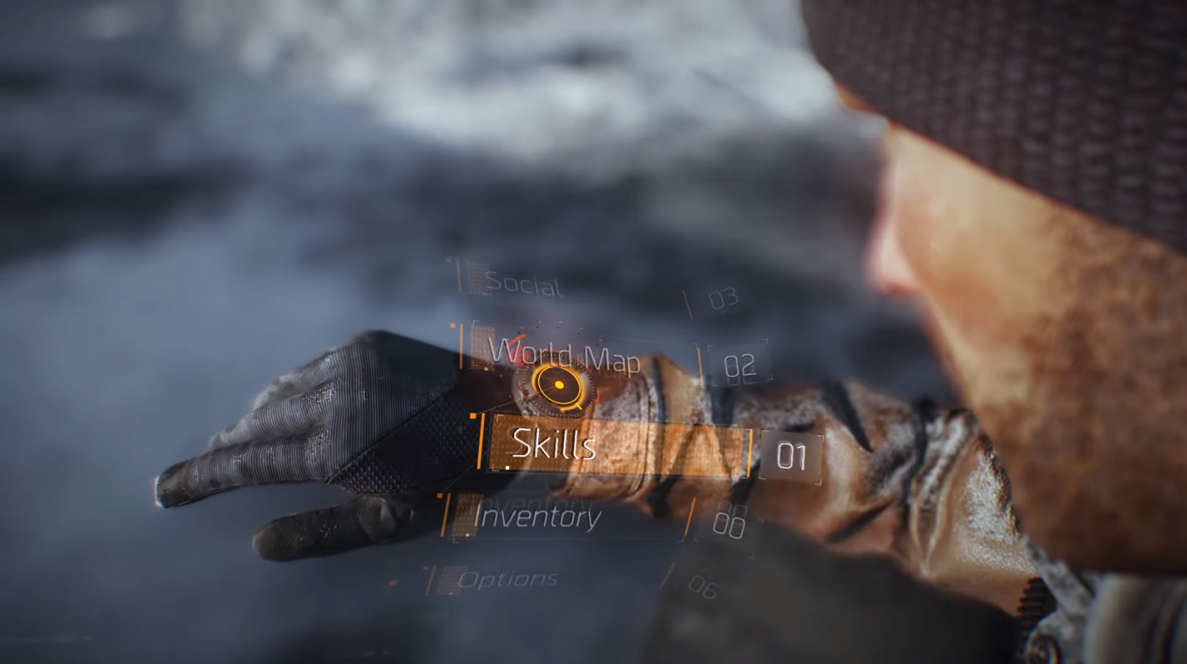
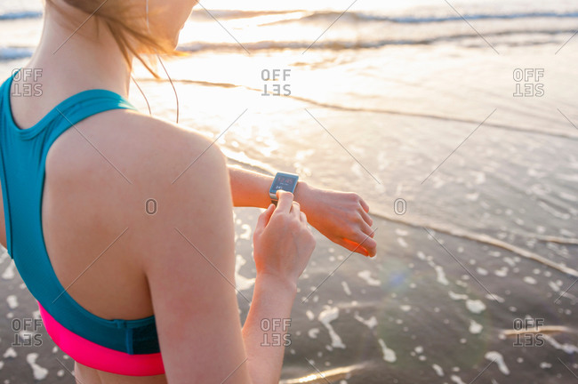
For part of my trailer I want to show off the technological advancements in the environment and setting, but at the same time use my editing skills to represent this. I want to use a birdseye over the shoulder shot to view a certain item. This will allow me to superimpose the effect but also make use of a key shot to help develop the story with props.

Image result for the division smart watch   

Image result for the division smart watch

Image result for over the shoulder looking at wrist
Equally I want various shots of the firefight I intend to include. These will each convey different emotions and points. For example by using close ups I can express regret and fear by the facial expression. However by using a shot of someone running towards others I can convey fear and anger in their character at the other people. As well as this shots of people on the receiving end can allow me to show various different emotions and ideologies by combining narrative with the shot.

Image result for firefight in a city
Image result for firefight in a cityImage result for firefight in a city


Plot Points.

A thew of the key moments in my trailer will be outlined and devout. However other parts can be made of footage to fill empty spaces, this can be of the main character wandering and roaming as well as searching bodies and overcoming small obstacles. This will allow me to have a few well thought out and scripted/narrated scenes as well as these fillers to lengthen the trailer.

These points are;
  1. Incoming message on a smartwatch
  2. Flashback to family life
  3. Firefight with scavengers
  4. Memories of civilisation(moving cars and busy streets)
  5. Flashback of daughter
  6. Becoming militant
  7. Before and after shot's
  8. How it all happened
These points can be made up of a thew shots and small sections of footage. Combined with the visual effects, narrations and music there will be a significant amount of footage that will be used.

Ending.

The ending of trailers usually detail the release date and main title/logo. This will be the same in my trailer, I intend to have a sharp cut in the footage and then fade in my title and release date allowing the music to slowly fade out ending the trailer. The main title can be seen below, it's an adaptation of "The Division's" logo. Where the main product would be about the moral divide in society after it collapses I have named it 'The Divide'

Image result for trailer endings


Opening.

In contemporary society people are very cautious with warning so trailers are often banded for certain audiences. To ensure my trailer seems professional I intend to add a red banded preview warning, this will also help re-enforce who my are audience at the start. as well as this the music will pick up as a shot fades in of my main character walking down the street with his back to the camera.

Image result for red band trailer

Friday, 16 December 2016

Props, Equipment and Costume

Props

The film my trailer is for, is set in a post apocalyptic period where a plague has dominated the majority of society. There are deep elements of survival engrained in the narrative and plot, so to survive and flourish in a period like this sometimes force could be considered necessary as I have already outlined in my Audience Effects post. So to really enforce this I have implemented an imitation firearm. This is as my product is a British film, and when we look at British film there is usually quite a lack of props such as firearms. This is due to the statutory gun laws in Britain, so Hollywood films often have an edge or advantage in the prop department which will draw more viewers. 

I have looked at legislation and it details that in 'Section 36 of the Violent Crime Reduction Act 2007' "It is an offence to manufacture, bring into or cause to be brought into Great Britain, or sell realistic imitation firearms. The act also makes it an offence to modify imitation firearms to make them realistic" However 'Section 37 of the Violent Crime Reduction Act 2007' States that a defense/exception may be made for the case provided that the use meets a list of mitigating circumstances, one of which being "the production of films and television programmes" This prop will only be used on times where I have discussed it's existence with my neighbours to prevent panic if used in my garden, and in my home. This is to prevent any misunderstanding. 

As well as this prop the main character will also have various other props attached to their costume. These will include items such as:
  • A Tornicator
  • First Aid Kit
  • Gas Mask 
  •  Multi Tool
  • MRE Rations
  • Smoke Grenade

Costume

My character is being designed with a rustic type patchwork idea in mind. He isn't initially built for survival and is slowly developing his understand as well as the gear he carries. I intend for the first shots we see him in to be in plain clothing that you'd see in day to day situations. However as the plot thickens and the story progresses he will start to gain warmer clothes and military uniforms. This fits in line with the plot as it will become progressively colder in winter months. Equally it is stated almost immediately that the military have a presence in humanitarian aid and riot control in the story. So with this plague combined with the anger and lawless society it's expected that some of these men and women would pass. let it be known I'm not stating that anyone should defface/steal from the bodies of the dead but as stated in the Audience Effects post there can be times where it is considered necessary and we wouldn't know them till we experience them first hand. 

Various items will come together to achieve a look that really reflects a survivor in my character. For example clothes that may be too big or are in poor condition, and then the pieces of military uniform they may find. By the end of the trailer I intend for my character to be wearing:
  • The 'Smart Watch'
  • British Multi Terrain Pattern Jacket
  • Jeans
  • A Beanie
  • Walking Boots/Shoes
  • A Military Style Patrol Bag
  • A Scarf
  • Gloves
  • Possibly a Bullet Proof Vest

Equipment

The equipment that I use will primarily be whatever is available to me at the time. The school have just invested in a new camera and hopefully I will be able to use this in due course. likewise we already have some camera's that have the capacity to film as well as take static shots, however for the most part I will probably use my iPhone SE.

This is as "the Apple iPhone SE is powered by A9 processor. The Apple iPhone SE has a 12-Megapixel primary camera on the rear and a 1.2-Megapixel camera for front facing photo's" This means I can get very close with a considerable amount of detail. For example in shot's where the character is lead down hiding I'm able to get good quality face shots. Likewise by moving myself on a desk chair with wheels I'm allowing myself to ensure moving shots and shot with professionalism as the camera will be easy to maneuver and it will eliminate the sound and wobble of the camera technician walking. 

Although these will be my primary pieces of equipment, Sandown Bay Academy have various professional recording devices with expert sound gear that would allow me to record sound more effectively. However as most of my sound will be edited in after i wouldn't need this during the production phase but possibly during post production to get a clean and crisp sound. As well as this I have the opportunity to use a green screen in my work. If i were to use this, it would most likely be to use as a backdrop for a news report.